
Three levels of visual product design
Krit’s Three Levels of Visual Design
There are numerous frameworks for thinking about design — by pros like Liddell, Norman, and Buchanan — but these are most useful for trained designers.
We’re not throwing those out the window, but we wanted something more straightforward for our team and clients. When we looked at the market and the clients who approached us, we realized most products fall into one of three levels of visual design.
At the bottom, Level One, are products that used to succeed in the cybersecurity space. These have immature, unenjoyable visual designs. At the top, Level Three, are products with mature, enjoyable designs gaining ground (and revenue) today.
Of course, our framework focuses only on visual product design, but visuals don’t exist in a vacuum. They’re an important part of the product puzzle, but they’re a part — not the whole. The visuals in a user interface (UI) work hand-in-hand with user experience (UX). Effective UX depends on business goals, technical and timeline constraints, user goals (unearthed by customer research), etc. In short, it takes significant groundwork to build great products, including the visual aspect of great products.
*When you look at each level below, keep this in mind: no level is inherently bad when you treat it as a stepping stone. The danger is camping out at the lower levels.
Level One: The Comcast level
Level One looks like a technically functional product with unrefined visuals and friction-filled, confusing experiences. There are no “Wow!” or “have you tried…??” impressions here.
Products can survive at Level One but usually do so when they’re the only option for a service or problem. Sort of how Comcast used to be the only option for cable and internet in many areas. It kind of worked and had few or no competitors. So, folks used the service or forwent cable and internet.

Other products that may camp out here include:
- Products that pull off something so technically difficult it’s hard for other companies to replicate.
- Products built quickly by engineering teams for VC investments that never bring in designers to help refine it — often driven by misbelief that security and usability are always opposite.
Notable Level One Challenges: Weak or nonexistent moats
Most niches of cybersecurity aren’t uncontested. Comcast-esque reviews like “sucks to use” won’t encourage customers to choose one product from another. So, to acquire and keep customers, Level One products rely on strategies like:
- An astounding sales team
- Solving a problem no one else has solved (for now)
- False proxies such as appearing large, well-funded, heavily awarded, and/or purchasing big ads and large floorspaces at conferences
None of these tactics create defensible moats. A moat refers to a company’s ability to maintain competitive advantages and protect market share. Moats, like ye olde castle moats, range in strength. They can be weak and hard to defend, strong and defensible, or somewhere in between. Level One products have weak or nonexistent moats. When a better-designed product comes for a Level One product’s castle and kingdom, the new product quickly clears the moat.
Level 2: The lookalike level
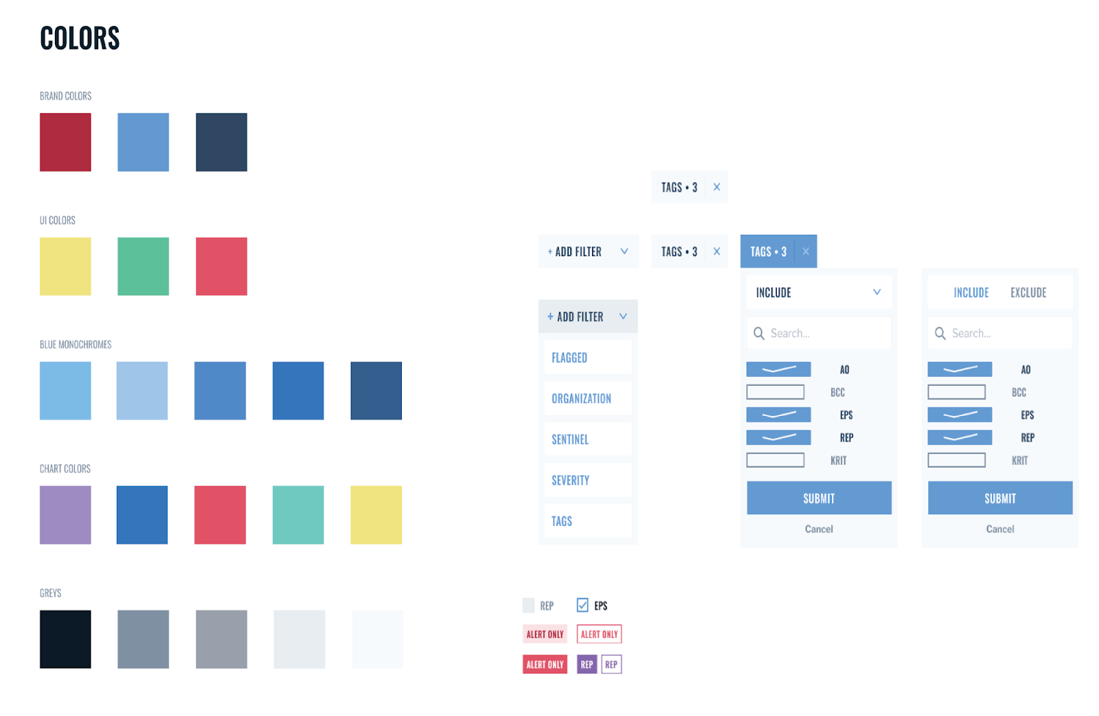
The majority of products in competitive markets live here. They do the four critical pieces of visual design well: typography (font choices and pairings), use of color, spacing, and consistency of elements (like buttons). But they don’t stand out. “The problem,” Austin Price, Krit’s Partner and Creative Director explains, “is everything starts to look the same because everyone’s using the same frameworks.” (Such as Bootstrap.)
When Curiefense first approached us, their visuals were at level two.

Since then, we've helped them take it up to a Level Three:

Notable Level Two challenges: opportunity costs and weak moats
The biggest challenges with Level Two products are weak moats and opportunity costs.
Weak experience moats
Level Two products have a fairly weak moat; they’re easily overtaken by products with great visuals and experiences. “It’s not going to make as much of an impression on people,” Austin cautions. “Your product isn’t necessarily differentiating itself from others in the market.” So, like Level One products, Level Twos have to rely on other moats such as securing recommendations from analysts, strong sales teams, and proxies.
Opportunity costs
A Level Two design only pulls part of its weight. This means other arms of the business have to work much harder to do the jobs the design could be doing. Jobs like encouraging word-of-mouth marketing, boosting retention, reducing support requests, and driving annual recurring revenue. This means owners of Level Two products don’t realize the gains better design could drive, and they’re spending more on other parts of the business to compensate.
Remember: Level Two is a great stepping stone
Again, this level isn’t inherently bad as a stepping stone. We move through Level Two when we design product interfaces at Krit. One of our first design checkpoints is called a visual design system, and it defines things like color palette, what grays we’ll use, typography, form elements like text inputs and buttons. It plants a flag in Level Two.
But we don’t stay here. We build on and improve this system (a topic for another day) to deliver a Level Three mockup.
Level 3: The gold standard
Level Three products are the hardest to spot, explain, and build. These products work well, feel dreamy to use, and are memorably associated with a specific brand — they have personality and a “WHOA” factor.
Take GreyNoise. Here’s what their product looked like when we first met them:

Compare that to the Level Three version that’s driven a 62% increase in daily active users:

Of course, visual design doesn’t account for all of GreyNoise’s success. Their clever team built incredible technology, learned from decades of experience, and crafted a strong business. Visual design doesn’t substitute for those elements.
What Level Three visual design does do is drive customer adoption and retention (which improves revenue) and creates hard-to-breach moats. After we partnered with Andrew Morris, CEO of GreyNoise, on the visualizer redesign, he explained, “Anyone who wants to come and eat our lunch now has to do something at least as good, if not better.” Level Three products look great, feel great, and customers love using them — really love using them. So, those customers need an excellent reason to go elsewhere.
Thinkst Canary as another example of “top-level” visual design in cybersecurity
“It will become increasingly obvious that thoughtful design leads to better product adoption, less churn, and – hopefully — better products overall,” Haroon told us. Haroon has over a decade of experience in infosec and is one of the clever minds behind Thinkst Canary — a product that hit $11M ARR in 2021 with one sales guy and zero raised capital.
Canaries look like real devices on a customer’s network and can be deployed as hardware or software. But if they’re accessed, they trigger an alert to let the organization know they might have been compromised.

Fans rave about Canary, but they don't just part with praise. Customers who have been with Canary from day one have increased their spending (some up to 10x), and a recent Canary Net Promoter Score (NPS) run came in at 80 out of 100. If you’re unfamiliar with NPS, 80 out of 100 may look like a “B-,” but it’s actually a jaw-droppingly high rating. For context, 80 is higher than Apple, Zappos, Costco, and other giants who’ve staked their entire name on delighting customers.

Notable Level Three Challenges
Level Three is worth climbing up to for the potential acquisition, retention, and revenue benefits. But this level has challenges, too. Most notably, maintaining Level Three standards is demanding. “It's much easier to design a Level Three product as a whole at the same time,” Austin explains, “because you think about it at such a holistic level at the beginning.” It’s more challenging to continue doing this at speed as the product grows, expands use cases, and acquires new types of customers.