
Level Three design: How to identify and achieve the gold standard
At our design agency Krit, we know from working with top startup teams that there are three levels of visual product design. And that only Level Three products have memorable personalities and a strong “WHOA” factor. These products inspire trust, confidence, and positive first impressions, which can help product owners improve acquisition, retention, and revenue.
Such as the $11M annual recurring revenue Thinkst Canary achieved in 2021 — with no raised capital and one salesperson. Or the62% daily active user increase GreyNoise saw when they redesigned their dashboard.


In the images above, you can feel the difference between Level One GreyNoise and Level Three GreyNoise.
But it’s rare you have both versions in front of you. Which makes confidently identifying Level Three in the wild difficult. To recognize Level Three — and then achieve that standard in products — stakeholders need a more robust vocabulary and a better understanding of the design process.
Recognizing Level Three: Six visual cues
Confidently recognizing Level Three involves building out your design vocabulary — knowing which cues indicate the gold standard and why.
Here six visual cues Level Three products incorporate:
- Texture
- Depth
- Color effects
- Subtle motion
- Custom illustrations
- Witty microcopy
Austin Price, our Partner and Creative Director, explains, “These are examples of visual design elements you can use.” But, he cautions, you don’t have to use all or even most of them. The key is using some of them with consistency.
One caveat, though: these cues aren’t like sprinkles on a cake. Designers can’t grab a big handful and toss them with abandon, knowing the design will work wherever and however they land. Each of these cues is more like sugar, yeast, or vanilla extract. They have to be used to the right degree, and in the right combination, to create a Level Three visual interface.
1. Texture
Texture elements communicate roughness, smoothness, fuzziness, ridges, grit, and other sensations you experience in the non-digital world. Level Three interfaces use textures to make designs more interesting, direct attention (“look here!”), and evoke emotional responses.
Texture can be pronounced, like the lines in these waves we did for an old website.

Or far more subtle, like the background grid pattern we used in Rumble's branding (look closely).

Which texture a Level Three product uses is usually influenced by the brand. Rumble’s grid-style texture (and logo) is based on a key visualization in the brand.
Auth0 uses textures influenced by branding as well. Check out the fingerprint-esque background you see boldly on homepage and then subtly at log in. This texture is based on the concept of identity.

2. Depth
Depth creates a sense of distance or 3D-ness. It helps you perceive parts of a design as nearer than others. Texture can help create depth, as some of the examples above show. But that’s not the only way to do it.
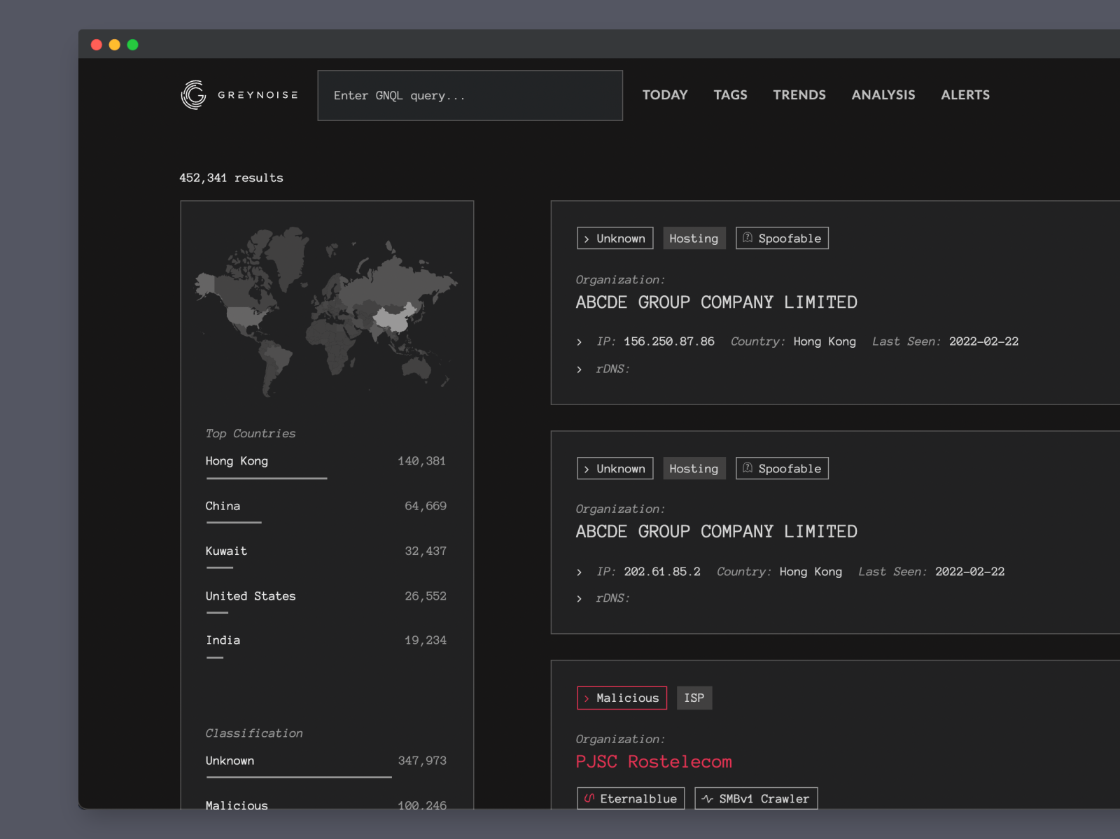
For GreyNoise, Austin used multiple variations of near-black to “pull” some items closer. In the image below, slightly lighter gray makes groups of information appear nearer than the dark-gray background.
Shadows are another way to create depth. Tines, a no-code automation tool for security teams, relies on color variations and shadows in their interface.

While there are several ways to apply depth, using the same approach throughout the entire interface is a key distinguisher for Level Three products.
“This is one where consistency is a big deal,” Austin cautions. “If you're using shadows, you need to be using the same type of shadows across the app. If you're doing the flat colors (like we did with GreyNoise), you shouldn't also have shadows randomly throughout the app.” Level One and Level Two products achieve depth using inconsistent methods, whereas Level Three products master a cohesive approach.
3. Color effects
Treating colors in a distinct way is another tool designers use to add visual flair to an application. Two examples of this are glow effects and gradients.
Glow effects make parts of designs appear illuminated — elements seem to emanate light, like a neon sign. Glow effects are particularly useful for highlighting important pieces of information. They’re often used in brands that have a technical, nerdy audience.
In the Orbital executive report below, we could have used a flat yellow border to highlight certain boxes. But we used a glow effect, which makes the box appear lit up, instead. When used sparingly, this creates interest, highlights important information, and creates an atmosphere reminiscent of video games.

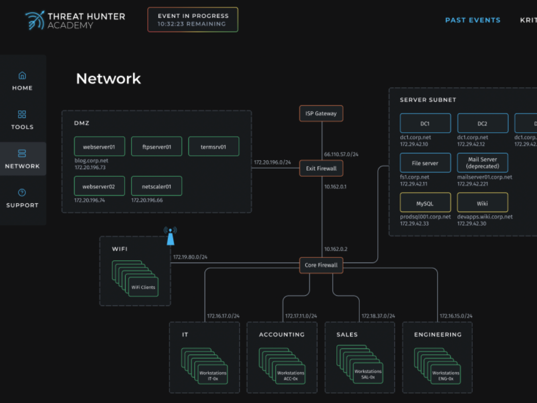
Gradients are another way to create visual interest with color effects. In the Threat Hunter Academy example below, we used a subtle gradient in areas like the “Event in progress” box. This helps visually distinguish one bit of information from another.
However, it’s important not to go wild with color effects. It’s easy to overuse glows and gradients and this overuse can exhaust customers and users.
For example, Stripe uses gradients on their homepage to create a visually distinct brand. But we’ve since seen many other brands, often Level Two ones, attempt to replicate this — the result is this loud style now feels tired.

4. Subtle motion design in animations and transitions
Subtle movement is another way Level Three products create interest, encourage focus, and add personality. Designers can use movement to animate specific elements, the way Thinkst Canary does with their mascot, Inyoni (Zulu for bird). The result is a playful welcome.
Nick Rohrbeck from Thinkst explains Inyoni’s animation isn’t just for a bit of fun, though. You can find him in other parts of the interface where “he also fills a real need. There are times when you could be on a section of the site where you won’t notice an alert come in…Inyoni will politely nudge in to let you know that there’s something for you to check out.”

Haroon Meer, founder of Thinkst, notes customers really like easter eggs like Inyoni. He told us, “doing those things delights people, and they want to pay us more.” Though, he says, they’d still add in the playful touches if customers didn’t.
Subtle motion can also make necessary transitions more interesting. On GreyNoise’s search page, we crafted an animation that adds motion just beneath the search bar. It appears as soon as the page loads. This adds a bit of fun, piques the searcher’s interest, and fits the command-line-style brand.

Animations can also provide orientation. When a user hovers over any of the seven key actions in Tines, the icon boxes move a bit. That motion reinforces the user’s location and hints at drag-and-drop capabilities.

5. Custom illustrations or iconography
Illustrations and iconography are symbols that represent an idea. The “send” symbol in email (there’s a version in the Tines gif above) and the heart you use to “like” items on social media are both examples of icons.
Illustrations are more involved decorations or images, such as the whiteboard designs you see throughout our website.

Many Level Two products make excellent use of high-quality, free illustration libraries, such as the Humaans collection by Pablo Stanley. These are wonderful, but they contribute to the “same-ness” many Level Two products share. Level Three products invest in custom illustrations and icons to elevate their designs.
For example, GreyNoise uses subtle, custom icons to help users differentiate between actors, worms, activity, and more. The icons also reinforce GreyNoise’s unique branding. “They’re fully composed of simple, thin lines,” Austin points out, “which was inspired by the logo and the visual styles you typically see in a terminal window.”

On the more elaborate end, Rogie, a designer advocate at Figma, creates the custom icons on his website. Note the animations, which add a “bouncy and fun” feel.

6. Witty microcopy
Microcopy is the small bits of text in an interface like error messages, form labels, button texts and calls to action (CTAs), and any other form of written prompts. Level Two microcopy is, at minimum, clear and helpful. But Level Three products sometimes incorporate microcopy that is clear, helpful, and on-brand.
Tushy, a modern bidet company, has the opportunity to use bathroom humor — and they take full advantage of that. Their tagline is, “The modern bidet that saves your ass, saves your money, saves the planet and saves the world.” Their instruction manual used humorous bits of microcopy as well.
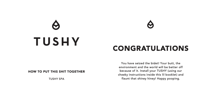
Most brands won’t be this overt with their humor, but Tushy proves witty words can liven up historically dull products.
Loom, a video messaging platform, offers a more subtle example. When you launch the Loom overlay through their Chrome extension, it takes a second to load. During that time, Loom shows playful rotating microcopy such as “Did you get a haircut?” Or, in the example below, “1 smile = 1,000 words”. This clever microcopy directs attention and fits Loom’s friendly brand.

Achieving Level Three: The Three “C”s
As Austin mentioned earlier, elevating an okay design to Level Three isn’t about throwing cues in a pot (or design tool) and giving it a quick stir. “The trick,” he explains, “is picking one or a few of these and implementing them consistently across the product.”
Pulling that trick off relies on at least three Cs:
- Cross-industry influences
- Creative experimentation
- Collaboration
1. Cross-industry influences
Visual inspiration can come from anywhere. The Orbital report we crafted drew inspiration from video games such as Doom.

The attack pathways bar and the highlighted edges of boxes were both inspired by the video game’s interface.

Other successful designers cast wide nets, too. Rogie, a Figma designer with a penchant for horror movies, pulls from playful Disney concept art (the images below are for the 2016 film Moana).

Our clients have also pointed us to books and TV series for mood inspiration (how something should feel) and spaceship and airplane control panels for dashboard inspiration.

Getting “outside the bubble” of a niche takes a bit of effort, but it’s what helps a design team craft visuals that don’t look like the competition.
2. Creative experimentation
Incorporating inspiration then requires experimentation. Specifically, it requires taking cross-industry inspiration, isolating an idea from the inspiration, iterating on that idea, and then distributing what works throughout the interface.
When we designed Scope’s new dashboard, we knew data visualizations were a key part of the product’s value. To craft those, the first thing the design team did was gather inspiration from various industries.

Then, they took the idea of a line graph and iterated on it. Austin explains the conversation went a bit like, “Here are some ways we can do a stacked line graph; let’s expand on that. Now, let’s use some of the same structure but adjust the layout.”
They experimented by adjusting colors, pulling numerical highlights, removing background tints, etc. One of our design principles is, “Simplify interactions repeatedly. You likely won’t land on the most elegant interaction the first or second time, it takes iteration and refinement.”

We do this for both big and small parts of a Level Three design. Our designers start with the big picture and elements, then repeat the process (taking inspiration, isolating and iterating on an idea, distributing it throughout the inferface) for more minor elements, such as severity level indicators.


This experimentation involves keeping a close eye on functionality, too. A visual element may look good in one view, like desktop, but translate poorly to mobile. So, experimentation requires figuring out which styles worked best for both.
3. Collaboration
Leveling up is not a quick process. It takes weeks of behind-the-scenes work, sometimes more. “The client doesn’t see a lot of this,” Austin commented. “It’s a lot of internal work we do just to get to a point where we’re showing the client a coherent design.”
Most of it happens with a team, as well. At Krit, Level Three involves several designers crafting and critiquing concepts, developers weighing in on options, and project managers helping all this happen at pace. Plus, clients chime in on directions and revisions.
It’s why several of our design principles focus on discussion and working together:
- Every design solution has tradeoffs, and it’s important to identify and discuss them
- If you can’t give an elevator pitch for what you’re designing, keep asking questions until you can
- Call out assumptions and try to validate/invalidate them
- Over-communicate your work with Figma comments, Jira notes, Slack messages, and any other medium your team/clients use
It takes, as they say, a village.