
Design duolingo - building your visual design vocabulary
Product users judge products by their covers. Your product’s “cover” is its visual design, and understanding what goes into it is a critical skill for anyone who manages a product:
- It lets you help customers use, love, and tell others about your product and brand...
- ...which helps you grow and effectively monetize your product. On repeat.
However, visual product design is an enormous and nuanced field, and if you’re just dipping your toes into it, it can feel very overwhelming. So, we’ve broken down where to start.
Four design elements have an outsized impact on visual design
When it comes to a product’s visual design — how a product looks and feels — there are four elements that have outsized impacts:
- Typography
- Spacing
- Use of color
- Element consistency
We cover each one below, but they’re not listed in order of importance. Because these items are a bit like a jazz band: each element is important on its own, yet none is more important than the other. And when they all work together, you get something greater than the sum of its parts.
1. Typography
Typography is the art of arranging letters and text. It involves choosing fonts and styling your written content. When you adjust fonts in Google docs, you’re dabbling with typography.
In products, designers style button text, instructions, error messages, and any other words that appear in the interface.
“Typography organizes the content on the page. It guides the user’s eye through the layout so they know what order to read things and how important a specific piece of information may be.” — Nathan Nash, Product Designer at Krit
Ideally, typography helps the reader reach their goals quickly and easily. But that isn’t always the case, especially if a designer or developer makes the common typography mistake of using a font that looks fancy but is too hard to read. Like Fast Taco below…or is it “Fart Taco”?

The owner certainly intended their sign to say “Fast”, but unfortunate styling opened up other interpretations.
Other big typography mistakes we see are:
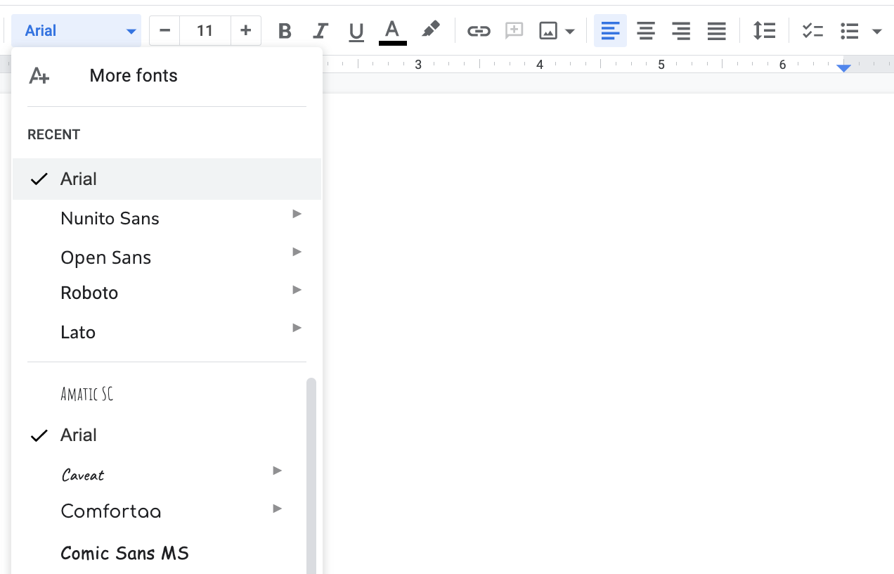
- Using too many fonts. Products that go “font crazy” create distracting interfaces, which in turn make it hard for the user to know what to pay attention to.
- Using too few fonts. On the other end of the spectrum, products that use only one font make paying attention difficult as well — nothing stands out, and everything looks the same.
At Krit, we find a balance. We often use one style with unique characteristics for headings (we call this a display style) and a different, legible style for all other text.
“There’s a balance. We most always use 1-2 typefaces on a project.” — Austin
- Choosing jarring combinations. Some styles don’t look good next to each other — like someone wearing a polka-dotted shirt with striped pants. This, too, is distracting.
- Ignoring accessibility. Accessibility is about making barrier-free products. Accessible typography is easy to read and comprehend for everyone, including those with low vision. Mistakes here include using styles that muddle letters (like Fast Taco), excluding headings (which help organize text), or adding text that’s too small. Speaking of which,
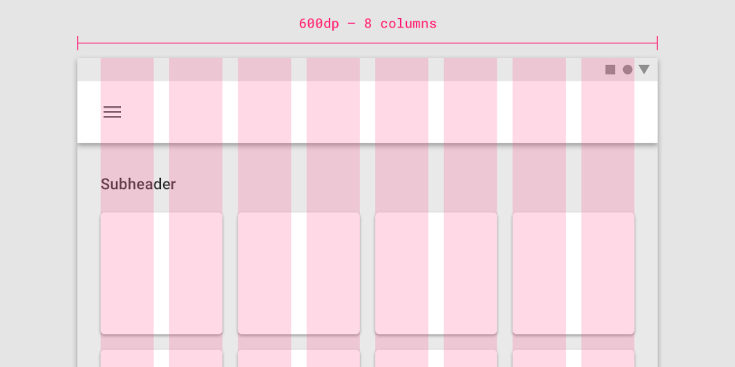
- Ignoring scale. When all text is the same size or willy-nilly sizes, the typography is unbalanced. Balanced typography relies on a scale, like in the image below, where each text size is proportional to another.
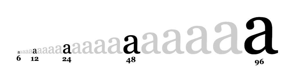
“One mistake I see a lot of beginners make is not using a typographic scale in order to establish a sense of visual hierarchy, vertical rhythm, and balance.” — Nathan
Great typography avoids the mistakes above. It’s balanced, accessible, and to scale. It’s also what we call “on-brand,” which means the styles of the text fit the personality of the brand. Often, this requires choosing uncommon fonts.
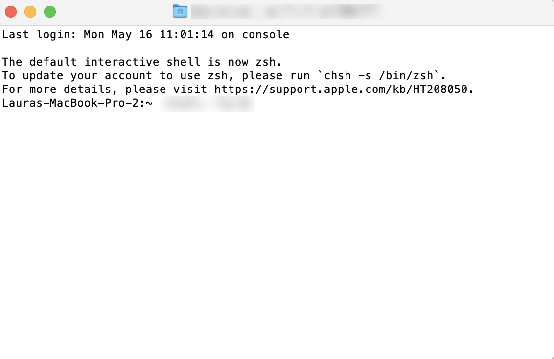
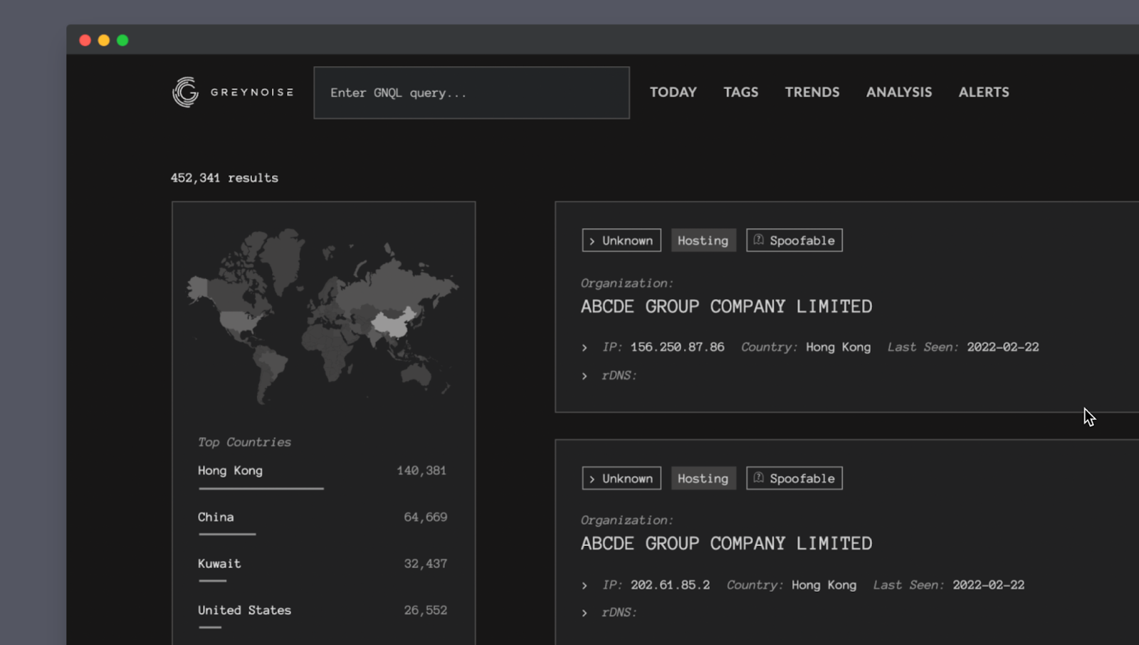
GreyNoise is a good example of this. We knew their customers are familiar with the command-line interface (CLI), a text-based console you can use to run programs and manage files.
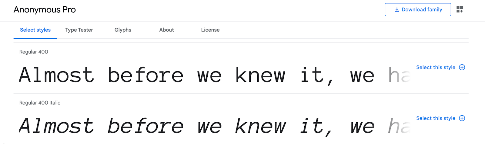
So, one of the fonts our designers chose for GreyNoise is called Anonymous Pro. It intentionally looks a bit like the style of a command-line interface, is highly legible, and fits the technical brand.
What you should aim for: great typography that uses balanced, accessible, to-scale font types, fits your brand, and doesn’t create unnecessary distraction or confusion for your users.
2. Spacing
Spacing is about how designers group content. It’s also about the white space designers use around groups so users don't get overwhelmed. Good spacing helps your eye flow about the page easily — you see what you need to see, in the order you need to, without any difficulty.
Most spacing mistakes relate to grids and negative space:
- Grids are kind of like the blueprint pads architects use. They provide structure, scale, and perspective when a designer creates a layout.
- Negative space, also called white space, is the space around other design elements. It helps focus the user’s attention and gives groups “breathing room.”
“Good use of spacing not only adds a rhythm to the layout, but it also gives the user’s eye a place to rest (white space). This allows content to breathe without feeling too cluttered.” — Nathan
Grids and negative space mistakes often look like a lot of information packed too close together. When that happens, it’s very hard to know what to pay attention to. For example, here’s the elevator panel in a local hospital.
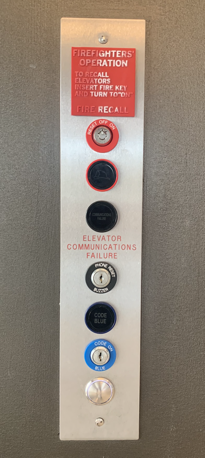
The very bottom button is the one pressed hundreds of times each day. Yet, it’s last and grouped with the top six buttons — which are rarely used, and only by a very different set of people. I’ve taken this elevator numerous times now, and it still takes me many seconds to figure out which button I should press. That’s poor spacing, and it creates a frustrating experience.
Good use of spacing, on the other hand, effectively answers the question, “what’s important?” and “what information belongs together?” for the user. Then, white space gives each group room to breathe.
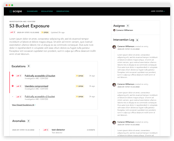
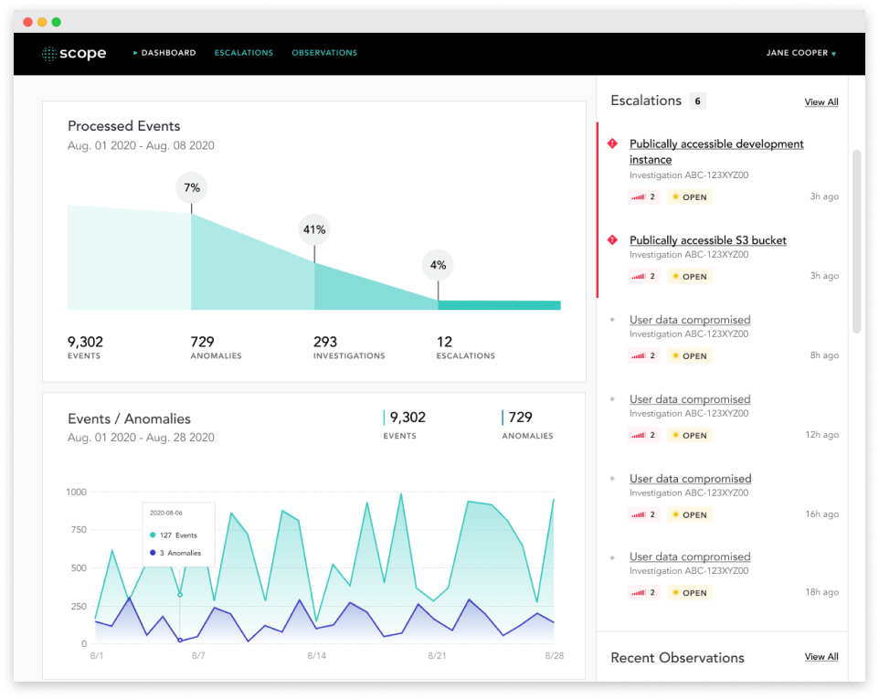
Check out the Scope dashboard below. While there are tens of pieces of information on the screen, you immediately see three groups: Processed Events, Events/Anomalies, and Escalations. We created them by organizing different types of information (escalations vs. events). Then, we used white space to set each group apart. All of which helps busy healthcare executives, who reference the dashboard, painlessly find the information they need.
What you should aim for: spacing that relies on a consistent grid, incorporates plenty of negative space, and helps your user focus on the most important pieces of information.
3. Use of color
Use of color is all about which colors a designer chooses and how they use them throughout the product to convey meaning.
The term “color palette” refers to the first part — the colors a designer picks. The second part, how the colors are used, includes choosing which colors go where (are buttons blue or yellow?), and any unique effects, like gradients or glow effects.
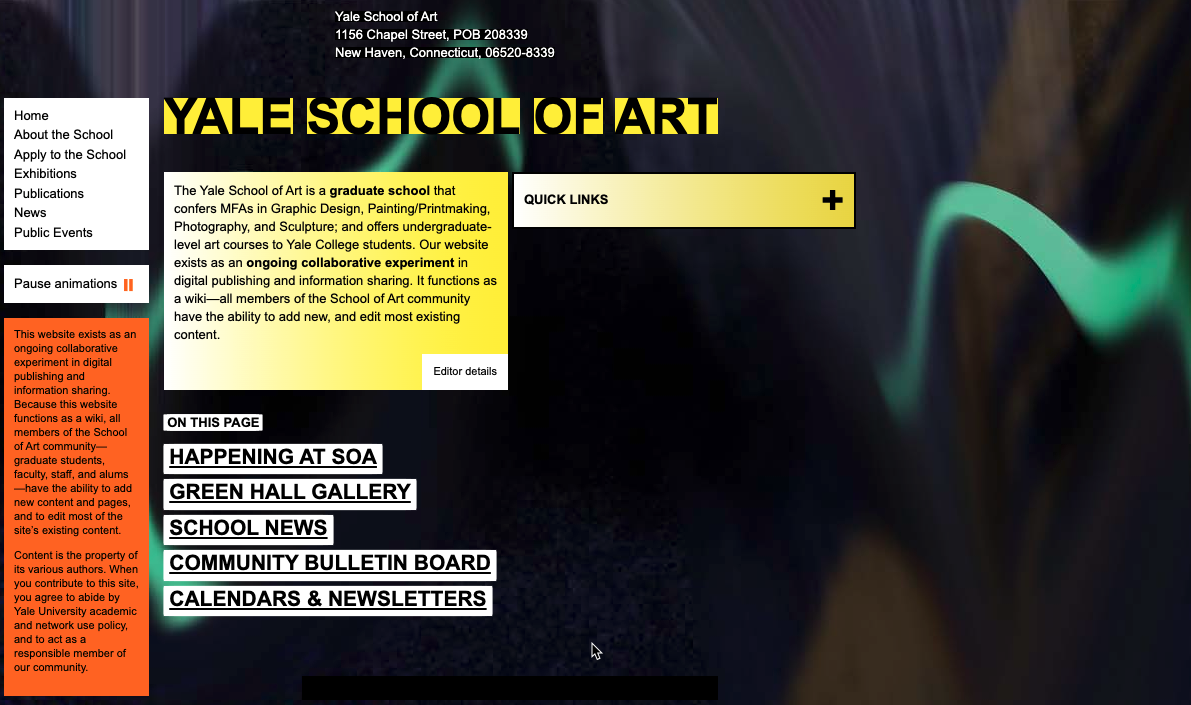
One of the biggest mistakes we see with color is going overboard, as Yale School of Art does below.
Other common mistakes (many of which you see above) include:
- Dismissing a palette. Instead of using one set of colors everywhere, some products look like a kid chose crayons at random, which can be extremely distracting for a user.
- Using culturally charged combos. Some color pairs are inextricable from cultural events or holidays. In the US, this means red + green scream “Christmas!” and orange + black say “Happy Halloween.” Unless you’re a Christmas or Halloween product, those associations don’t work in your favor. (Keep in mind colors and color pairings can have different meanings in different cultures.)
“Another common mistake that I see is using culturally charged color combinations such as green/red (Christmas) or black/orange (Halloween).” — Nathan
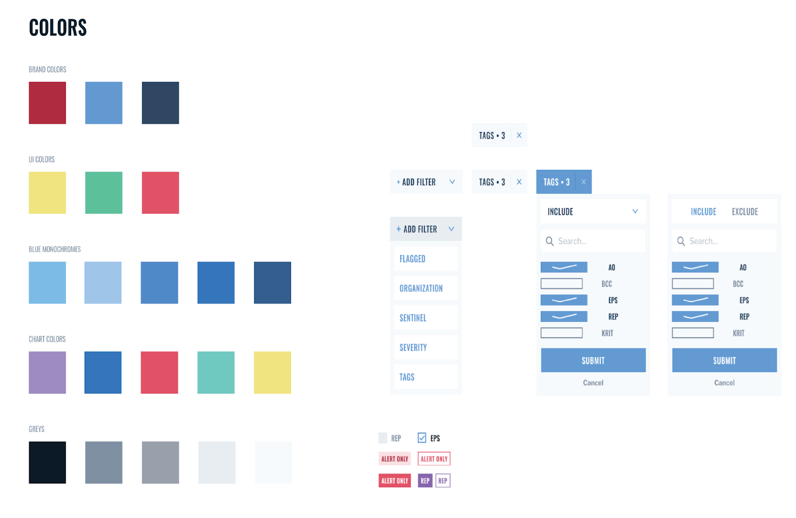
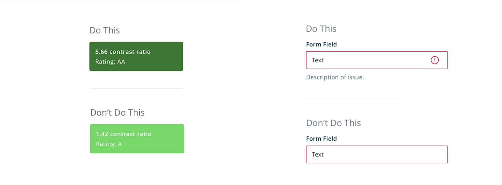
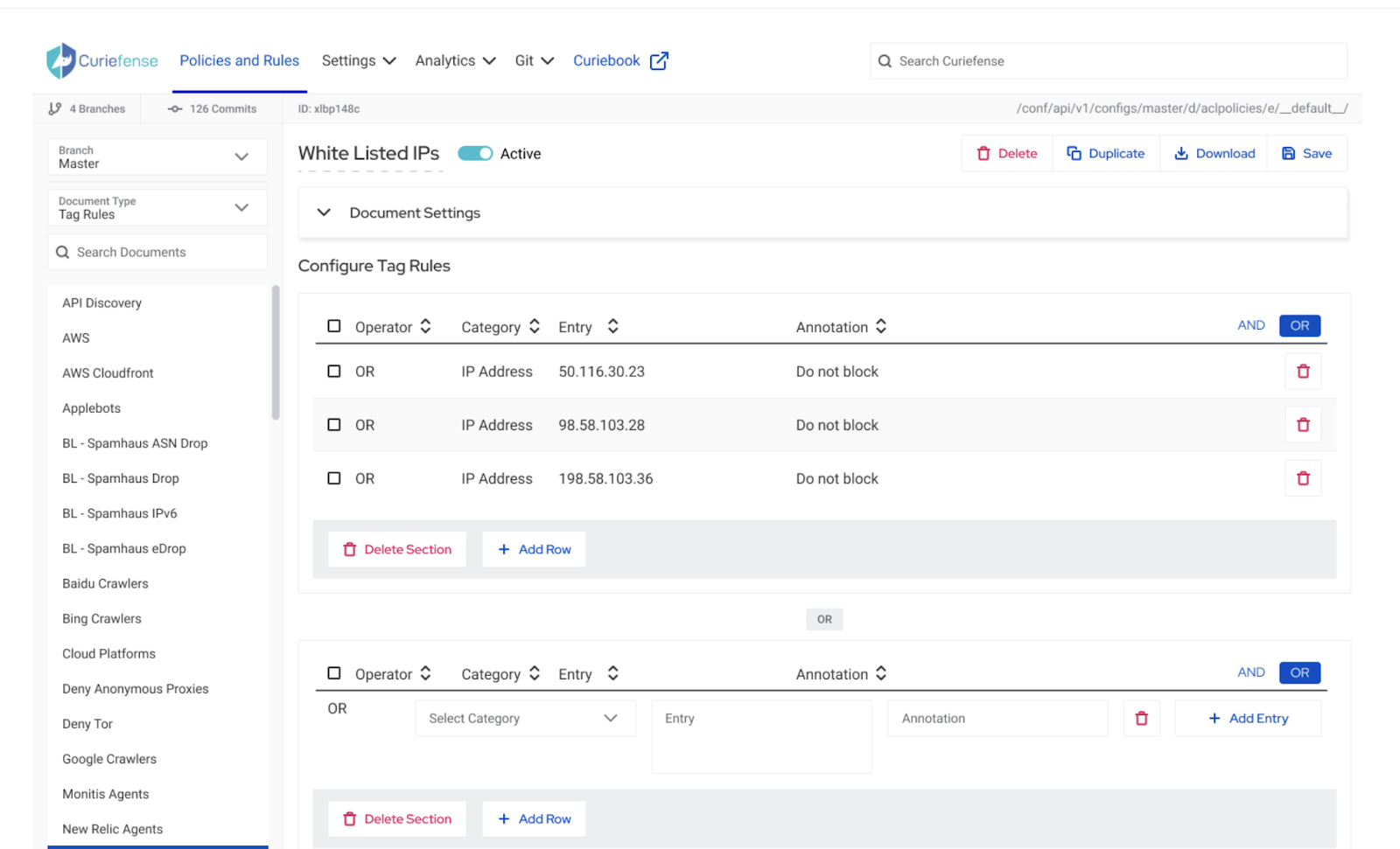
- Ignoring accessibility. Two big accessibility mistakes make products challenging for folks with low vision and/or color-blindness. One is choosing low-contrast color combinations (left, in the image below). The other is relying only on color to communicate something, like an error (right, in the image below).
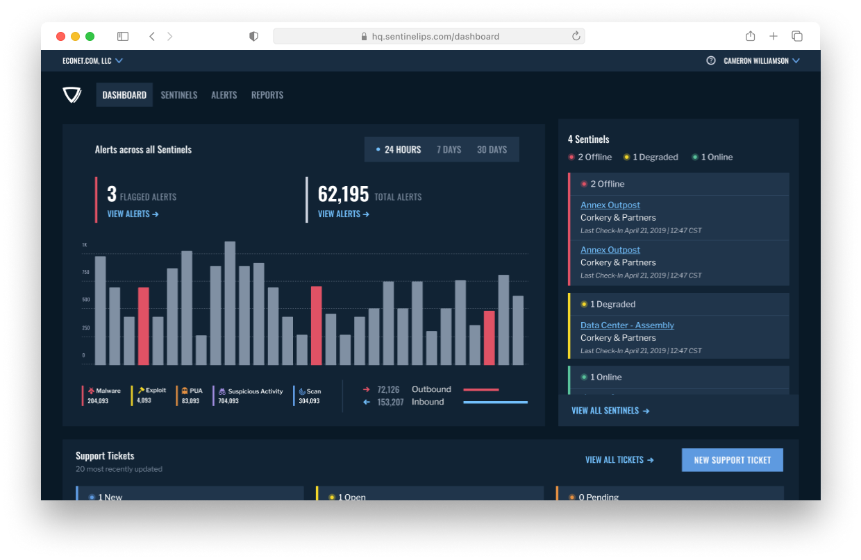
Great color use will rely on a limited palette, use colors in accessible ways, and fit the product’s brand. Keep in mind that this is possible whether the palette is “light mode” like Curiefense, or “dark mode” like Threat Hunter. You can see both consoles below.

In both these interfaces, we:
- Limited the number of colors we used
- Used color primarily for accents
- Gave each color a job
- Applied color-job pairings consistently
- Relied on elements (e.g. icons) other than color to communicate meaning
What you should aim for: an accessible, on-brand palette that uses a small number of colors, avoids culturally charged pairings, and gives each color a job.
4. Element consistency
Element consistency is what ties typography, spacing, color, and every other design element together. It’s the through-line.
“Consistency builds trust in the application and the user experience. If the user can begin to expect or anticipate future behaviors based on past experiences, then they will feel more comfortable in the application.” — Nathan
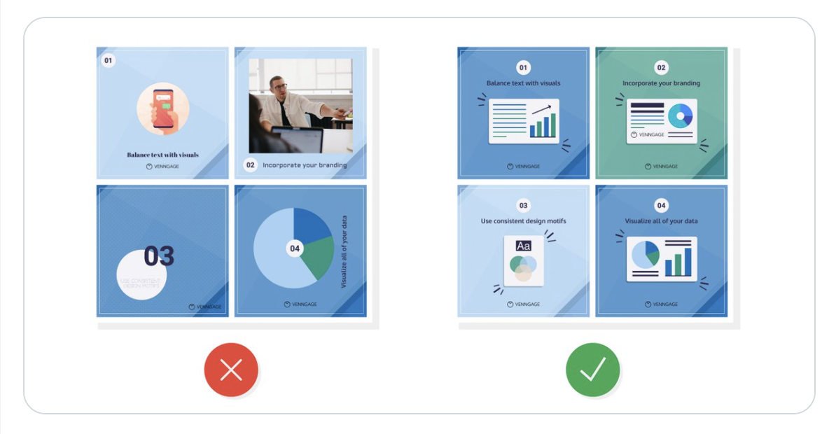
Most folks get this one wrong by (you guessed it) being inconsistent. They use one style here, another there. Ryan McCready posted the helpful simplification below on Twitter. The image on the left feels more jarring and “off” than the image on the right. That’s because it’s inconsistent.
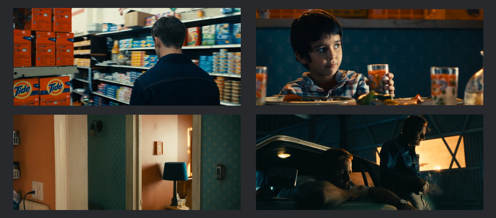
The 2011 film Drive is a great out-of-the-box example of palette and style consistency. Throughout the entire movie, the crew used a subtle blue and orange colors. Check out the four stills below: each frame incorporates the same palette.
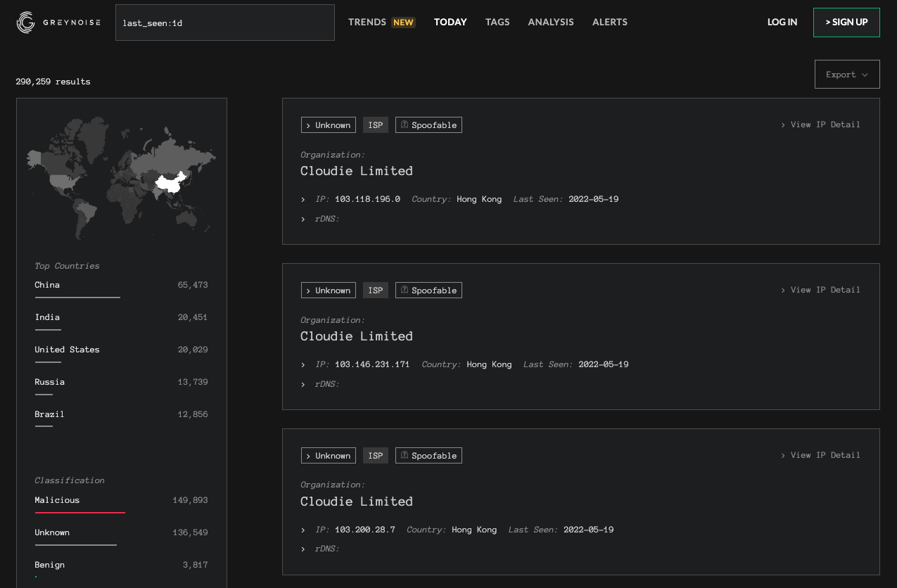
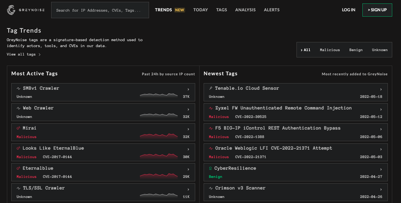
Like Drive, great products apply the same color palette (and typography and spacing) on every screen. The GreyNoise images below illustrate this concept: we carried the same typography, color use, and spacing approach through every screen.
What you should aim for: a consistent interface that applies the same typography, spacing principles, and palette on every screen so your users feel at ease in the product.
Cool, but where does that leave you?
Review your product and take stock of your typography, spacing, color, and consistency. Where can you do better? Are there any areas where you can simplify, or improve how easy it is for your users to understand and navigate the interface?
“If you have a product, and you want it to be more polished, take stock of typography, spacing, and colors, and simplify what you have going on there.” — Austin
You can also train your design eye on other people’s products. Every time you interact with a physical or digital product, especially one you really like or dislike, slow down. Ask yourself what colors they use and what effect they have on you. Likewise for the fonts and spacing. Is there anything the product does well? What about poorly? What can you learn from it?
Finally, if you enjoyed this visual design primer, you may find our once-a-month newsletter useful. We’ll send you more primers, breakdowns, and case studies that will help you both design better products and work with folks who do.